Colour: its influence and impact on the way we live

We are surrounded by colour, but its significance in our lives goes far beyond simple aesthetic impressions. It has practical applications that help us navigate our environment. It can affect our mood. And in societies across the world, colour has extensive historical, cultural and symbolic attachments. It is often used, subtly or explicitly, to carry and influence the values of our society. Vien Cheung reflects on the power of colour to shift our judgements – and how it might help us move towards a fairer and more balanced world.
In March 2020, pictures of rainbows began springing up in windows across the UK. As the country went into its first COVID-19 lockdown and schools closed, teachers encouraged children to paint a bright, cheerful rainbow and pin it up for the outside world to see. It was a token to spread the spirit of togetherness throughout the community and of hope for the more favourable times that would come again.
Rainbows – or even more so, rainbow colours – are symbols of hope, movement and the declaration of equality, diversity and inclusivity. But we also use the term ‘Chasing rainbows’ to mean pursuing goals that are unrealistic, fanciful, or unlikely to be achieved. Perhaps rainbow colours in all their variety, paradoxically, also signify just how many obstacles we still need to overcome in order to achieve more balanced, cohesive and united societies.

The world is very rich in colour. Most computer monitors are capable of displaying about 16 million different colours. It’s been estimated that our visual system can distinguish about 2 million, but colour is so much more complex than simple aesthetics and characterisation.
Colour coding is used in design and production to help identification and categorisation. Specific colours are strongly associated with certain psychological or mental states. The presence of such colours in our environment influences our emotions and wellbeing. Colour has extensive historical, cultural and symbolic attachments.
Colour codes have been used to stereotype people by gender, race, or class. Societal values are a powerful way to change our perceptions and behaviour. Indeed, colour could be a universal and effective vehicle for such change.
My research


I am an Associate Professor of Colour and Imaging Science at the University of Leeds. A good portion of my research discusses the impact of colour on wellbeing, behaviour and performance, as well as the need for understanding cultural differences in the meaning of colour.
I’ve been at the University for over 15 years. During that time, much has changed both academically and personally, but what has become obvious is the use of colour by the University, the fashion world and society as a whole in shaping our environment and influencing our perceptions.
In its new strategy, the University sets a blueprint for being a values-driven university. Such a university harnesses its expertise to help shape a better future for humanity, to tackle inequalities, achieve societal impact and drive change across the world.
I want to explore how, through bridging and shaping colour awareness across institutional and geographic boundaries, we can increase understanding of equality, diversity and inclusivity.
Can we change the notion of ‘What does colour mean to us?’, and so, by transforming the associations we give colours, can we transform the values in our society?
The world is the image of the two rituals: the sun and the moon, daylight and darkness, sunrise and sunset, and so on. The law of the universe is that our life is always wandering between the two rituals and seeking to be all inclusive. Having a strong preference for one side of the two rituals can only be bittersweet.
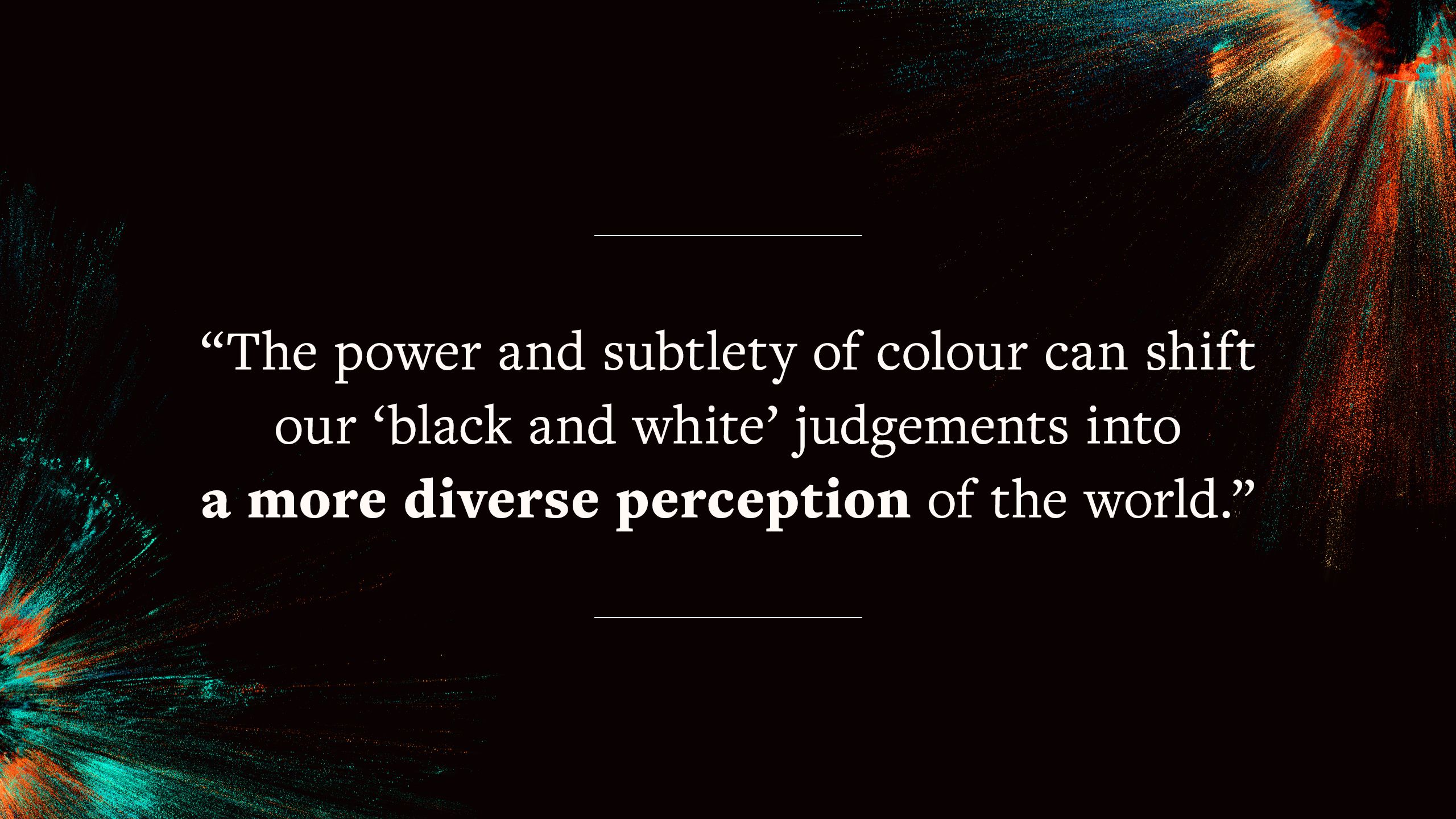
This reflective essay explores how the power and subtlety of colour can shift our ‘black and white’ judgements into a more diverse and expansive perception of the world.
The function of colour

Imagine you’re back in the Stone Age. Much of your time is spent searching for food. One sunny day, you notice lots of wild berries. Yesterday they were green, today they are purple. They’re ready to eat. It’s an easy task to collect the dark berries from the green bush before being spotted by any predators which may regard you as ‘dinner’!
However, consider the alternative scenario where there is no colour spectrum. All you can perceive is a multitude of shades of grey. That ability to differentiate when berries are ripe and distinguishing fruit from foliage accordingly becomes much more challenging. The chances you’ll starve to death or be eaten yourself due to malnutrition become much higher. Thankfully our colour perception has helped us navigate around our environment and evolve successfully.
Nowadays, we still use colour for effective identification and categorisation, but may not recognise that we’re surrounded by many different ‘colour codes’ which shape our daily life.
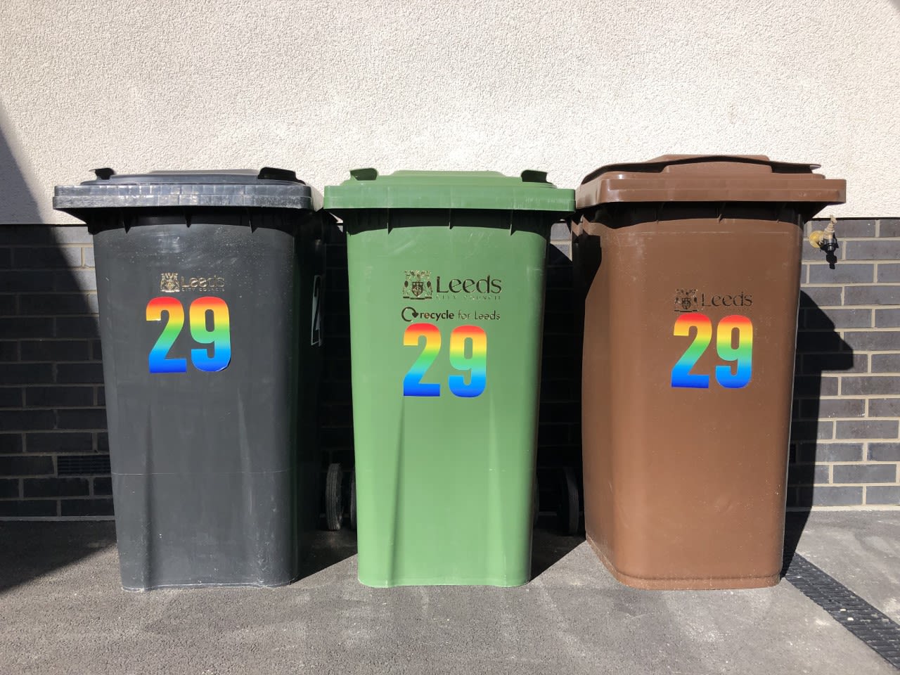
A blue cap on a ballpoint pen tells us the pen contains blue ink. In the UK an electric plug has a blue neutral wire, a brown live and a green/yellow colour for earth. A less electrifying example is the colour of bins in the city of Leeds: by simply separating our household rubbish into black, green or brown wheelies, we can do our bit to help create a more sustainable world.
As part of an initiative by the UK Government to improve public health, the ‘traffic light’ labelling system for food was introduced, to give consumers an immediate idea as to whether it has high (red), medium (amber/orange) or low (green) amounts of fat, saturated fat, sugars and salt.


An example of the ‘traffic light’ food labelling system used in the UK. Red indicates that the biscuits contain high amounts of fat, saturated fat and sugars. Image: Vien Cheung
An example of the ‘traffic light’ food labelling system used in the UK. Red indicates that the biscuits contain high amounts of fat, saturated fat and sugars. Image: Vien Cheung
A brief history of colour

But the significance of colour goes well beyond simple object recognition.
In both the West and the East, there’s always been a strong belief that colour is integral to the nature of the universe. In the ancient Greek world, there were four basic colours: black, white, red and yellow.
These were believed to be the four irreducible colours of the spectrum. They represented the four roots of nature, from which the world is made: water, air, fire and earth. The Greek mindset prevailed for centuries in Europe, throughout the Middle Ages into the Renaissance.
In China, as early as 1600 BCE, a comprehensive philosophical theory existed consisting of three spheres of origin (heaven, earth [ground/land] and human), two cosmic energies (yin and yang), and five elements (wood, fire, earth [soil], metal and water).

![Symbols of the five elements of a Chinese philosophical theory: wood, fire, earth [soil], metal and water.](./assets/bcd3Exnogs/05-chinese-five-elements-930x240.jpeg)
The five elements of a Chinese philosophical theory: wood, fire, earth (soil), metal and water. Image: Vien Cheung
The five elements of a Chinese philosophical theory: wood, fire, earth (soil), metal and water. Image: Vien Cheung
Within the five elements, blue-green corresponds to wood, red to fire, yellow to earth, white to metal, and black to water. Each of us belongs to one of the five elements and its colour, depending on the year, month, day and time of our birth. Using these colours in the correct way is the key to a balanced life. The Chinese theory is fundamentally connected to harmonic living practices and is still widely used today.
In the late 1660s, Isaac Newton made many advances in the scientific study of colour. He was the first to understand the physical composition of colour. He passed white light through a prism, resolving it into its constituent components: red, orange, yellow, green, blue, indigo and violet. Newton also suggested a colour circle for these components, where violet is located between indigo and red.
Studies suggest there are connections between colour combinations and harmony.
In the early twentieth century, Albert Munsell went further and developed the Munsell system, which classifies colour into three dimensions: hue, brightness and colourfulness.
The hue of a colour is whether it is essentially red, orange, blue, and so on. Brightness (also known as lightness) is whether it is bright/light or dark. Colourfulness (also known as chroma, saturation or vividness) refers to intensity, from weak or pale to strong or deep.
The combination of different hue, brightness and colourfulness options generates millions of colours and provides a framework that captures the breadth of colour possibilities and choice.
The psychology and culture of colour


Studies suggest there are connections between colour combinations and harmony, with reassuring feelings of a ‘pleasing’ appearance, visual rightness and coordinated balance. For example, neighbouring hues (such as red, orange and yellow) generate a colour ‘harmony’.
However, in a strong and weak colour combination, it is suggested that the strong colour should occupy a smaller proportion in order to maintain good visual balance. In addition, there is also a recognition of the close association of colours with certain psychological or mental states; for example, red, orange, and yellow are regarded as ‘warm’, green and blue are ‘cold’. Further, red is widely associated with aggression, blue with calmness.
Some uses of colour are culturally specific. In the West, the colour of mourning and death is usually black; in the East, it is white. Red signifies luck and fortune in China, so is often chosen for bridal dresses. In the West, it became traditional for brides to dress in white after Queen Victoria wore a white dress at her wedding and because of associations with purity and virginity.
Use of colour to stereotype can generate problems with damaging consequences.
Certain colours have also signalled or reinforced class distinctions. Purple was widely considered the colour of royalty, power and wealth, for instance. This is because, for centuries, purple dye was exceedingly rare, and its value was comparable to gold. In Imperial China, being the emperor was the highest honour on earth, therefore by law only the emperor could wear yellow, the five-element theory’s earth colour.
Colour can also be used to stereotype class differences. In the early twentieth century, the white shirt became popular attire for office workers in the US. At the same time, blue denim – a durable heavy cotton material – was well suited for manual workers. The terms ‘white collar’ and ‘blue collar’ have since been used broadly to describe jobs in the two different sectors – and the socio-economic class connotations around them. The term ‘pink collar’ has been used for jobs, such as nursing, secretarial and childcare work, that have traditionally been dominated by female workers.
Such use of colour to stereotype can generate problems, with damaging consequences on occasions. We only have to think of how apparent coding of people according to their colour (race) is detrimental to equality, diversity and inclusivity. However, these social connotations can and are changing slowly.
Nowadays, social conditioning in the UK assigns pink to baby girls and blue to baby boys. However, about 100 years ago, pink was regarded as a strong and masculine colour and blue was perceived as a delicate colour, hence it carried more feminine connotations at the time. Colour associations can not only develop over time but also can be completely reversed.
Over the rainbow

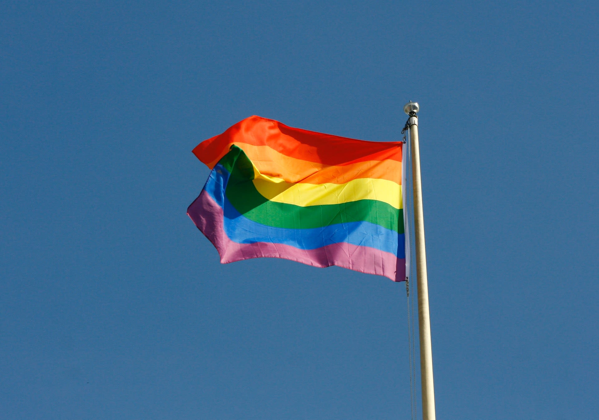
In the 1970s, a flag consisting of multicolour stripes came to represent the lesbian, gay, bisexual and transgender (LGBT) Pride movements and their drive for social equality.
Some suggest the use of multicolour, largely similar to the rainbow colours, was inspired by the song ‘Over the Rainbow’ from the 1939 film, The Wizard of Oz. Whatever the reason, the collection of different colours in the ‘rainbow flag’ provides a meaningful representation at once of diversity and of togetherness. It is meant to be for LGBT people coming from all backgrounds.
Over time, the acronym LGBT has been evolved to LGBTQ and now LGBTQ+, where Q and + refer to as queer (or questioning) and plus respectively. This evolution has been intended to make the movement the flag represents more inclusive of other identities, as well as to promote self-affirmation of individual identities within the movement.

Rainbow flag used to represent the LGBTQ+ Pride movements. Image: Trey Musk on Unsplash
Rainbow flag used to represent the LGBTQ+ Pride movements. Image: Trey Musk on Unsplash
There are other constructive examples around the world of using colour as an effective vehicle for equality, diversity and inclusivity:
- Pink Dot SG aims to support all LGBTQ Singaporeans and has promoted freedom to love for the last 10 years. The understanding of sexual orientation it represents is as a positive feature, not a barrier. The pink colour was chosen to represent the nation – it combines the colours of white and red found in the national flag of Singapore.
- The Light It Up Blue campaign encourages awareness and acceptance for those with autism. As auditory sensitivities are common among those on the autism spectrum, blue has been used to signify our willingness to provide a calming environment.
- Purple Day has been the international day for epilepsy awareness for over 10 years. Both the plant and the colour lavender are regarded as having a relaxing effect on our brain and nervous system. So this colour has a symbolic meaning to support those afflicted with epilepsy.
Since 2020, face masks have been very widely used as a way to limit the spread of COVID-19. When a young boy in Taiwan was bullied for wearing a pink face mask, the Taiwanese government took extra steps. At the press conference about the bullying, the Taiwanese officials all wore pink face masks. The colour of their masks was a clear demonstration of their commitment to gender inclusivity.
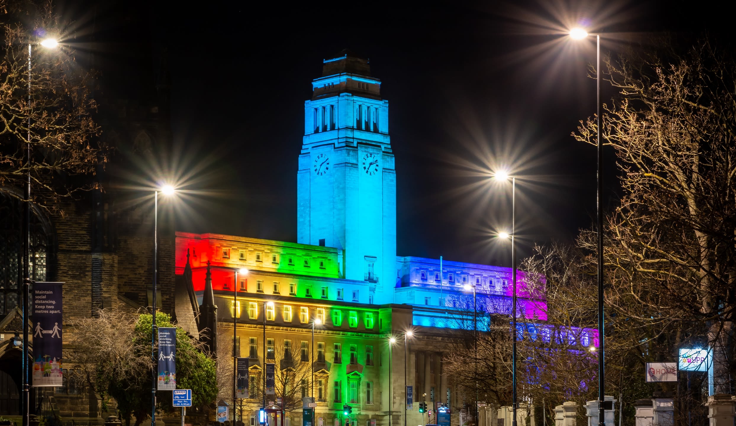
Here in Leeds, Light Night Leeds is the UK's largest annual arts and light festival. Started in 2005, this annual festival has attracted participation from local, national and international artists and brings the Leeds community together.
A significant feature of the festival is its use of large-scale colour light projections to provide a vibrant and yet integrated atmosphere. With its value on public engagement, for many years, the University of Leeds has been supporting the festival and hosting performances and interactive activities on its campus.
In recent years, the University’s iconic landmark Parkinson Building has also been putting on symbolic colour lights in support of different equality, diversity and inclusivity agendas such as:
- red – together with University College London in the UK – to mark World Tuberculosis (TB) Day and raise public awareness of the disease;
- purple for the International Day of Persons with Disabilities;
- pink – as one of 18 landmarks across the UK – to show support for the fight against breast cancer;
- rainbow colours to mark Leeds Pride.
The International Colour Association (AIC), founded in 1967, is an international organisation which promotes research and education in all aspects of colour. It comprises of a global membership of 28 colour associations representing 5 continents.
To increase awareness of the impact of colour in our everyday lives, the AIC established International Colour Day (ICD), which falls on the March Equinox, to celebrate the full spectrum of colour around the world. For more than a decade, the AIC members have been taking ownership of the ICD, hosting hundreds of colour events worldwide.
In my capacity as the AIC President, I am currently leading the association to expand this global public engagement activity, and to work towards an application for registering the ICD as one of the UNESCO’s global cultural annual events.
Beyond the rainbow


Continents, oceans, countries, populations all come in distinct shapes and sizes, but integrating these variations and differences into a single entity forms a world that is immeasurably more interesting, diverse and uplifting.
The Inuits have over 50 words to describe ‘snow’ but there are insufficient words in the dictionary to describe the diversity and subtlety of the blue sky and sea or the greens and browns in a forest. Nature’s colour palette is huge and gracefully harmonious, while our language is too limited to do it justice.
In the same way, every individual is different but together we form a community. The typical ‘norm’ within that community suggests we more readily accept people who are of different height, build, hair style, size of feet, temperament and so on. Isn’t it weird that we don’t then accept people who are of different personal identities?
Red, orange, yellow, green, blue, indigo and violet all appear visually differently, but together these colours make a unifying rainbow. If any of these colours is missing, it becomes incomplete and deficient.

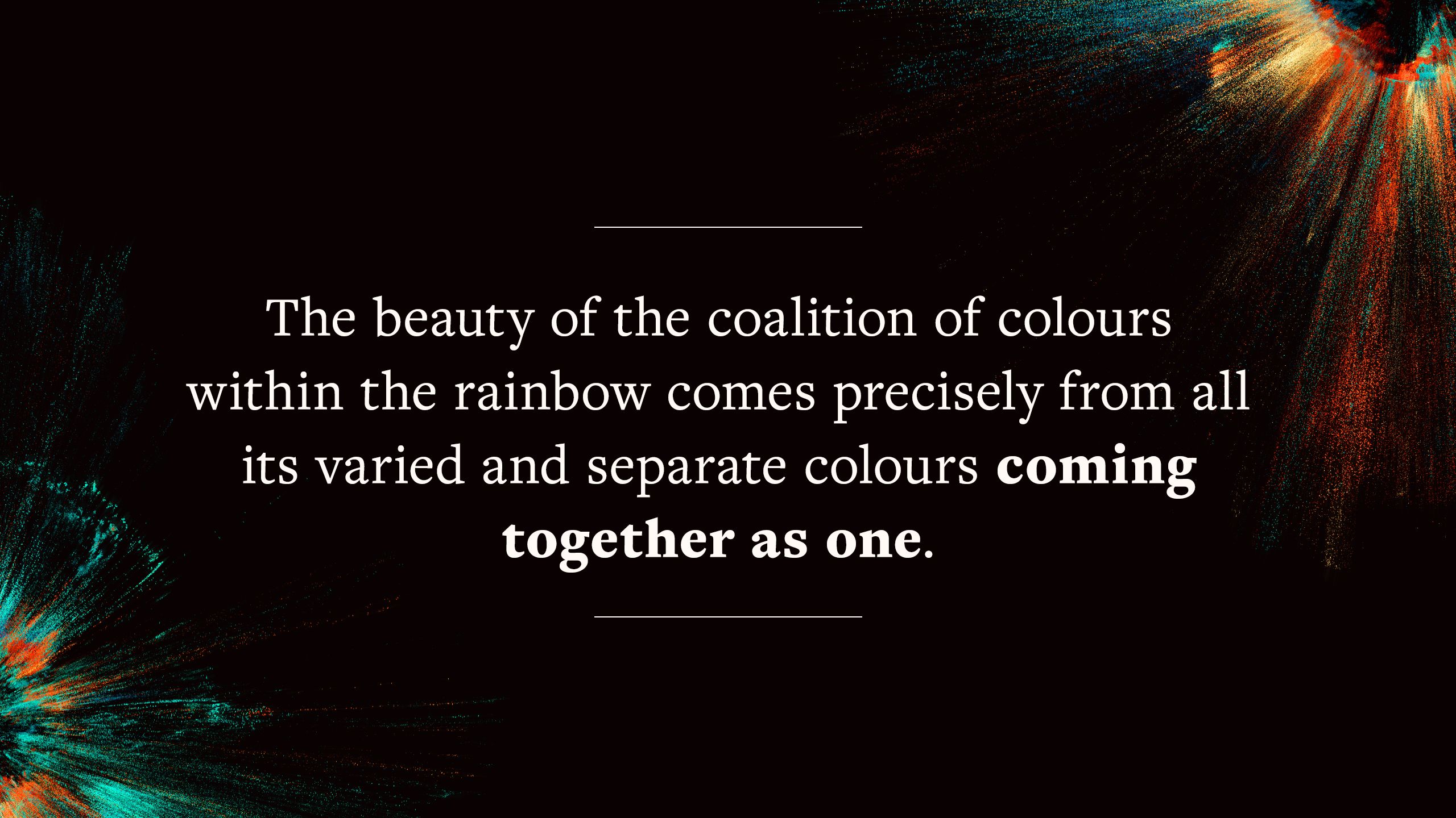
This representation of life and our society through visual colours in the rainbow although simple, is nevertheless elegant in its articulation of a higher goal in our daily lives. It may require many little additions to enrich the mix but ultimately it is a ‘coat’ we can all wear.
About the author
Dr Vien Cheung holds an academic post as Associate Professor in Colour and Imaging Science.
She has published over 100 refereed research papers, book chapters and book in the areas of colour (imaging, science, vision, design) and textile (technology, engineering, design).
She is active in charitable and educational organisations concerning colour including the International Colour Association (AIC), The Colour Group (Great Britain) and the Society of Dyers and Colourists.
She is also a writer for VC2 (weseetoo), on topics including existence, wellness, culture, value, universe, nature, environment and sustainable living practices.


Dr Vien Cheung
Dr Vien Cheung