This is the H1. It must be filled.
You must not use the banner image to convey the title of the story (for example, don’t use a designed image with the title embedded). You must give the story an H1 heading – this is essential for users of assistive technology.
This field isn’t a header type. Move left and right for best contrast with background. Likely have to use 75% or more overlay opacity in ‘Section Options’ with ‘Overlay Type’ as ‘Full’. Or use solid colour.

‘Text’ section
Can use
The ‘Text’ section looks like this. It’s fine to use as-is.
Don’t use a background image behind this text. The potential ‘scrollmation’ effect can be disorientating for some users. For the background colour of a ‘Text’ section, you should only use the ‘Light background’ or ‘Dark background’ options in the ‘Colour’ settings as they have been set to the University’s brand colours.
You need to use the ‘P’ button in the editing area if you want to create a heading. Don’t put text on its own line and make it bold.
This isn’t a heading
This is an H2 heading
The first heading after an H1 should be an H2. Shorthand calls it ‘<H2> Heading - Large’.
If you want a subheading within the section created by the H2, use a ‘<H3> Heading - Medium’.
This is an H3 heading
Similarly, a subsection under an H3 should use ‘<H4> Heading - Small’.
This is an H4 heading
That’s all the headings you get in a ‘Text’ section. But they work a little differently in other section types, such as ‘Text Over Media’.
‘Text’ section elements
Lists
Can use
- Lists, like this ‘ordered list’, should be kept within one Shorthand paragraph block.
- This is so the list is recognised by screen readers as one list of many items.
- Not several one-item lists.
- The same rule applies to ‘unordered lists’ like this bulleted list.
- An NVDA screen reader will recognise this as a list and announce “bullet” before each point.
Blockquotes
Can use
Blockquotes are announced as “blockquote” to screen reader users. So they should quote something already on the page:
Blockquotes are announced as “blockquote” to screen reader users.
Or a blockquote should quote something from another page/source with an attribution:
The University of Leeds is ranked in the top 75 universities in the QS World University Rankings 2024
Shorthand won’t allow you to apply a link to the source.
Indents
Can use
The text style immediately prior to this sentence is an indent. It is accessible. The indents on this page contain bold text. The default style is Roman.
Breakouts
Can use
This is a ‘Breakout’ box. It doesn’t cause the NVDA screen reader any trouble and has no contrast issues with the default text colour.
Buttons
Can use
As well as embedded images and video, the ‘Text’ section allows you to add a button.
The contrast between the white text and red button is strong enough to be accessible at this font ‘px’ size.
Dividers
Don’t use with default colour
The following object is a divider for visually separating text in the same section.
The default contrast between the grey divider and the off-white background isn’t strong enough to be accessible.
You must change the colour of the divider to the black (#0a0202) in the set of colours provided in the University of Leeds theme. Use the paintbrush icon to do this.
Spacers
Can use
These are accessible and there’s no explicit accessibility guidance to consider when using them.
Alignment
Limited use
Only use ‘align left’. This is the easiest to read for those with dyslexia.
Other text alignments can be hard to read for some due to the inconsistent start points of the lines.
‘Align right’ is especially bad for this and shouldn’t be used under any circumstances.
Text styling
Italic text
Don’t use
Italic text isn’t dyslexia friendly. It can make the copy harder to read. Bold can be used in some cases instead.
Bold text
Limited use
Lots of bold text isn’t dyslexia friendly. Only use for emphasis. Never for anything more than a short sentence.
If the bold text ends with a full stop, include the stop in the bold styling. Otherwise screen readers may announce the ‘dot’.
Underline
Don’t use
Underlined text can be hard to read for dyslexic users. It can also give the impression the underlined text is a link to those with certain types of colour blindness.
Subscript and superscript
Limited use
Don’t use subscript and superscript to simply style text for aesthetic purposes. Small text can be hard to read for many people.
Reserve subscript and superscript for scientific or mathematical contexts.
Don’t use superscript for ordinal number abbreviations, eg 21st, 22nd, 23rd. This can confuse a screen reader. NVDA announces these as “twenty-one-ess-tee, twenty-two-en-dee, twenty-three-road”.
Use normal text, eg 21st, 22nd, 23rd.
It’s also University style to not use ordinal abbreviation suffixes in dates. Proper style is, 1 January 2021.
Drop caps
Don’t use
This is an example of drop caps when used on a paragraph of text within a ‘Text’ section.
Assistive technologies cannot properly read the first word when the formatting of the stylized drop cap separates it from the rest of the word.
Zooming leads to a pixelated image of the drop cap when images are used.
Following the text flow becomes problematic due to the extended size of the drop cap (eg users with dyslexia may have trouble following from the drop cap to the first line or finding the correct next line to resume reading).
Columns
Don’t use like this
Don’t use newspaper-style columns. They can be hard to read for dyslexic users or people using screen magnification.
It is only OK to use two columns, if you use the left column for all the essential information (this will usually be the copy) and the right column for anything decorative, such as an image that is not important if it is missed.
However, it is much more accessible to only use one column.
This is an example of columns in a ‘Text’ section.
As well as noting the accessibility issues with using columns, it’s also worth remembering that the column styling would only be applied for those using desktop computers as the columns stack on mobile screens.
Text colours and contrast
Accessible body text colour and size combinations – light background
Can use
Default colour. Roman text.
First colour (#910000) in the theme palette. Roman text.
Second colour (#c70000) in the theme palette. Roman text.
Ninth colour (#0a0202) in the theme palette. Roman text.
Inaccessible text colour and size combinations – light background
Don’t use
Third colour (#ff4e36) in the theme palette. Roman text.
Fourth colour (#ff8a7a) in the theme palette. Roman text.
Fifth colour (#ffeded) in the theme palette. Roman text.
Sixth colour (#dedede) in the theme palette. Roman text.
Seventh colour (#6e6b6b) in the theme palette. Roman text.
Accessible body text colour and size combinations – dark background
Can use
Default colour. Roman text.
Third colour (#ff4e36) in the theme palette. Roman text.
Fourth colour (#ff8a7a) in the theme palette. Roman text.
Fifth colour (#ffeded) in the theme palette. Roman text.
Sixth colour (#dedede) in the theme palette. Roman text.
Inaccessible text colour and size combinations – dark background
Don’t use
First colour (#910000) in the theme palette. Roman text.
Second colour (#c70000) in the theme palette. Roman text.
Seventh colour (#6e6b6b) in the theme palette. Roman text.
Ninth colour (#0a0202) in the theme palette.oman text.
‘Text Over Media’: The top text box is an H2 by default
The second box is an H3 by default
The third is an H4

Can use
Be aware that using the default settings of a ‘Text over Media’ section may make your page heading structure non accessible depending on what you want to do.
There’s a good chance you don’t want an H3 directly after an H2 in the way Shorthand forces. And it’s very unlikely you’d want an H2 followed directly by an H3 and then an H4.
And using the top box (an H2) and the bottom box (an H4) but leaving the middle box blank (the H3) is an out-right accessibility failure because it skips a heading level (in this case an H3).
If you want to put copy in the second or third text box in this section - and it’s not a subheading of the first text box - we’d recommend to either change it to paragraph text using the ‘P’ button in the editing area - or only put text in the first box and leave the others blank.
Choose ‘BG Scrolls’ for the ‘BG Position’, and ‘No Fade’ for ‘Text Fade’.
Check the contrast between the background image and text colour. You’ll likely have to use 75% or more overlay opacity in ‘Section Options’ with ‘Overlay Type’ as ‘Full’.
‘Background Scrollmation’
Don’t use
It’s probably safest to avoid the ‘Background Scrollmation’ section type. There’s a chance the text and the images moving at different speeds will be disorientating for some users.
There’s a ‘Spacer’ directly following this text with its size bumped up to 100% to help illustrate the animation effect without using filler text.


‘Scrollmation’
Don’t use
The same goes for the ‘Scrollmation’ section. Especially how the image doesn’t move with the scroll motion, ‘sticks’ in place as you move and then ‘releases’ from the scroll.
There’s a ‘Spacer’ directly following this text with its size bumped up to 100% to help illustrate the animation effect without using filler text.


‘Reveal’
Don’t use like this
Don’t use text in the ‘Reveal’ section type. It has a good likelihood of disorientating some users.
Its accessibility when used without text is debatable but it may be less of a risk if it’s short, showing a transition between only two pictures.
The following ‘Reveal’ section doesn’t use text and just transitions between two images. It’s probably accessible for most.
‘Media’
The section following this text area is a ‘Media’ section type.
Images in the ‘Media’ section
Can use
Give images descriptive, concise alt text. Aim for descriptions under 125 characters. Don’t include ‘image of’ or ‘picture of’. Avoid assuming the race or gender of image subjects. Ask yourself whether your alt text could effectively communicate image content to someone listening on a phone call.
Make sure that complex visuals such as infographics, diagrams or images with information in them are easy to read on screen and the text in them doesn’t appear too small. You need to be able to describe what they show too either in alt text, or using the copy on the page, for people using assistive technology. Ask yourself if the user could be missing key information if they couldn’t see the diagram or image.
The ‘Caption’ field is optional and doesn’t have any explicit accessibility needs for a photo provided you’ve added alt text.


An image of a person surrounded by hot air balloons is the default image for images in the ‘Media’ section.
An image of a person surrounded by hot air balloons is the default image for images in the ‘Media’ section.
Images can also be embedded in a ‘Text’ section. The same accessibility practices apply here.


Example of an image embedded in a ‘Text’ section.
Example of an image embedded in a ‘Text’ section.
Videos in the ‘Media’ section
Limited use
Using the ‘Media’ section for a video appears to be accessible in certain cases.
Shorthand video player
The Shorthand video player (used if you want to upload a video file) can be controlled with just a keyboard.
But it doesn’t allow you to upload a captions file. So, if the video doesn’t have ‘burnt in’ captions, a deaf user cannot perceive the audio information.
This means the default Shorthand video player isn’t suitable for video that has important audio information (such as speech). It should only be used for decorative, non-informative video.
Third-party video ‘Rich Embed’
However, using the ‘Rich Embed’ option allows you to embed video from third-party sites, such as YouTube and Vimeo, by pasting the relevant URL.
If that video has captions, either ‘burnt in’ or closed captions the user can switch on and off, then using the ‘Media’ section for video in this way is likely to be accessible.
All embedded videos need a transcription of the video that describes all visual information, non-speech sounds (laughter, off-screen voices, etc), and verbal information. Ensure that you place a link to the video’s transcript adjacent to the media player when you embed it into the page.
Most embedded videos need audio description as well as a transcript. Audio description is a separate narrative audio track that is required in addition to the audio on the video. Audio description provides information about important visual content such as actions, scene changes and on-screen text.
You should upload the audio described version of the video in the same way as the original (eg on YouTube or Microsoft Stream) and link to this version wherever the original is shown (eg on YouTube or via an embedded video player).
In unusual cases where there is no important visual-only information, such as a ‘talking head’ video with no scene changes, it is acceptable to only provide a transcript.
The example YouTube video that follows, ‘Is it accessible? Digital Accessibility for staff at Leeds’, is accessible because the player can be controlled with just a keyboard, the video has captions the user can turn on and off, and there is a video transcript as well as an audio described version of the video that communicates the important visual information not declared in the audio.
You can also embed a video in a ‘Text’ section. This has the same accessibility concerns as discussed previously.
‘Media Gallery’
Can use
The ‘Media Gallery’ section is keyboard accessible. Users of NonVisual Desktop Access (NVDA) will hear: “Click to enlarge Media button”.
Make sure you add alt text to each image you use in the gallery and follow the accessibility practices mentioned in the ‘Images in the Media section’ part of this page.
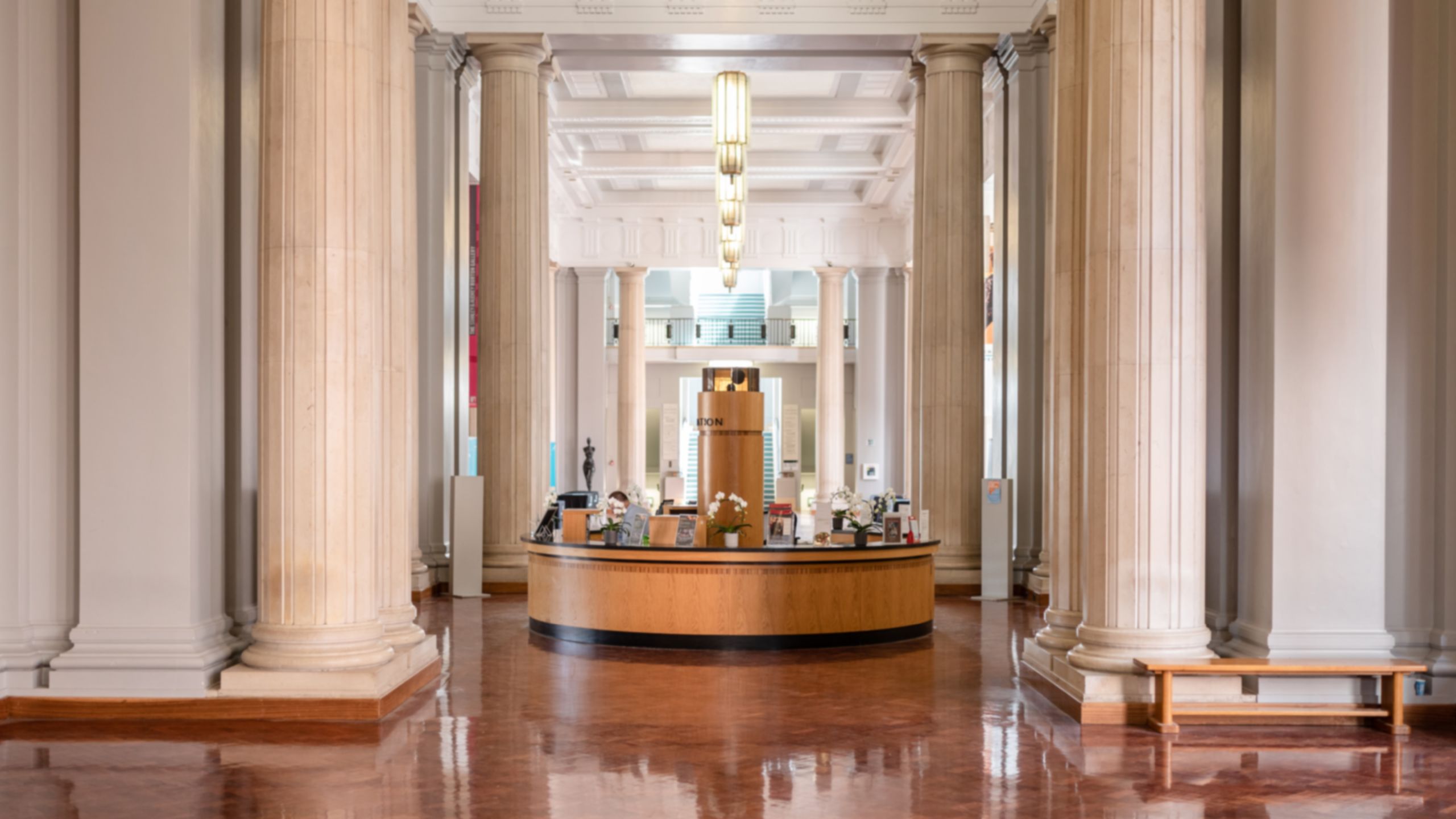
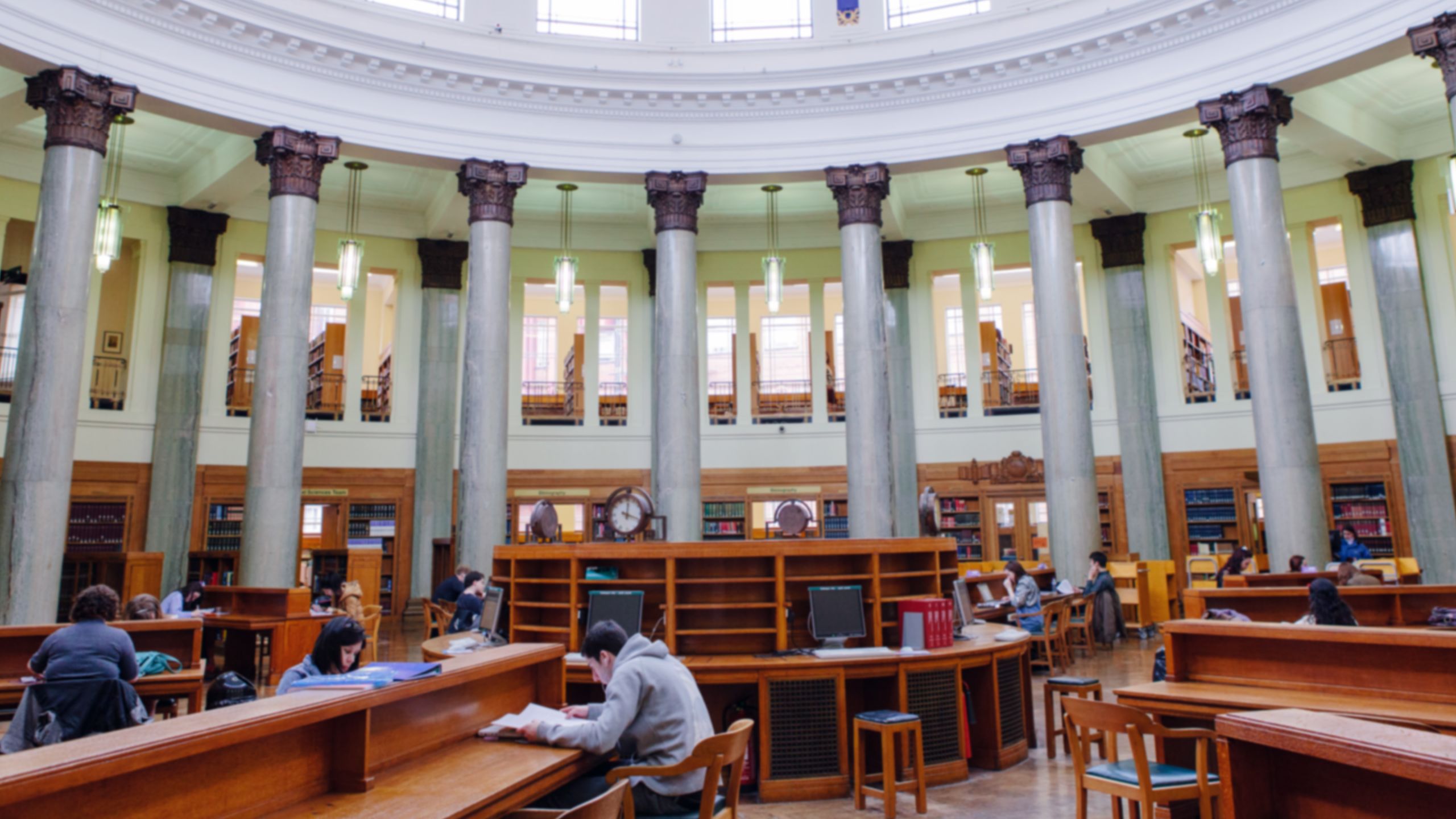
The interior entrance of the Parkinson Building.
The interior entrance of the Parkinson Building.

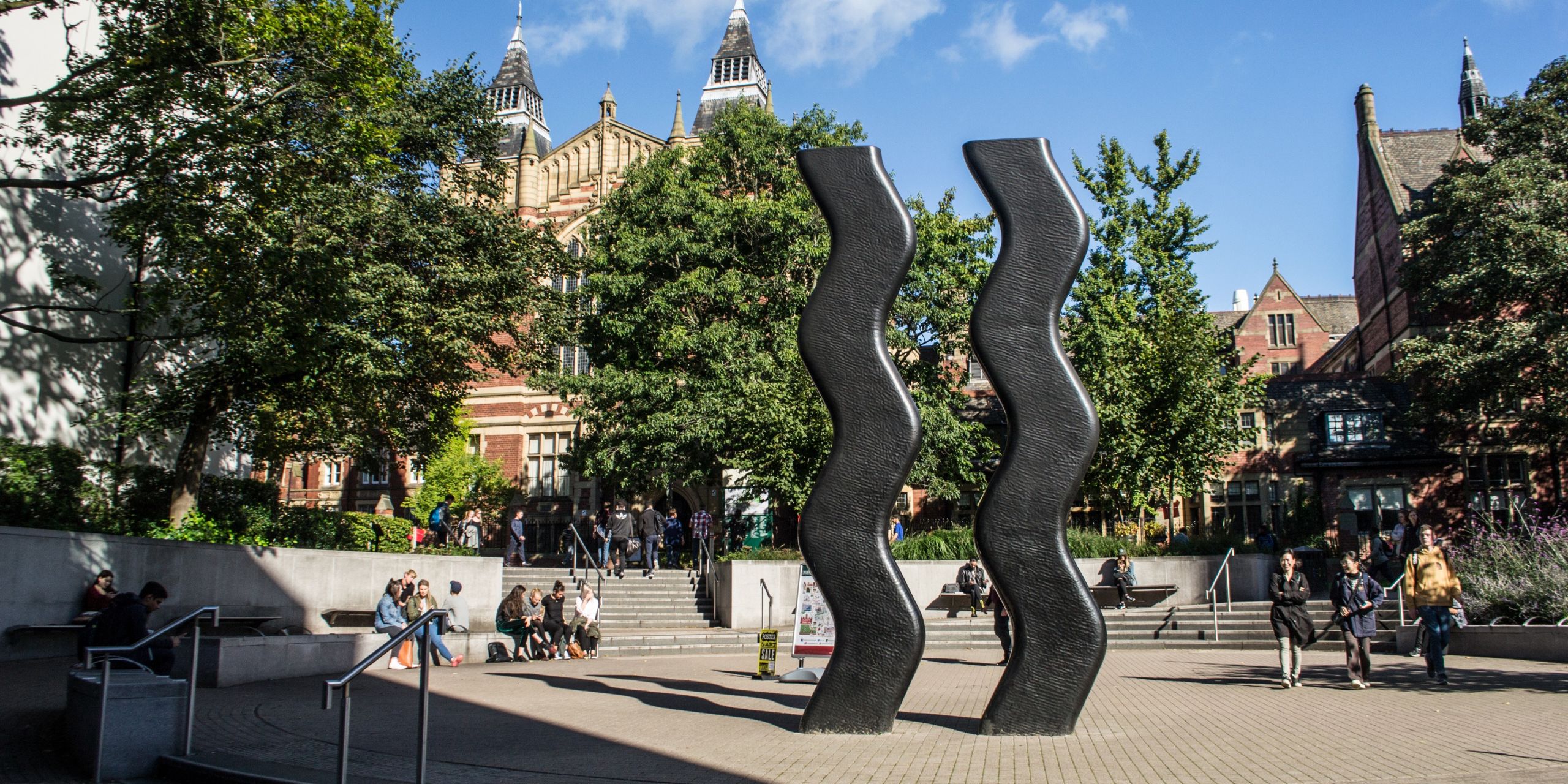
The red brick of campus.
The red brick of campus.
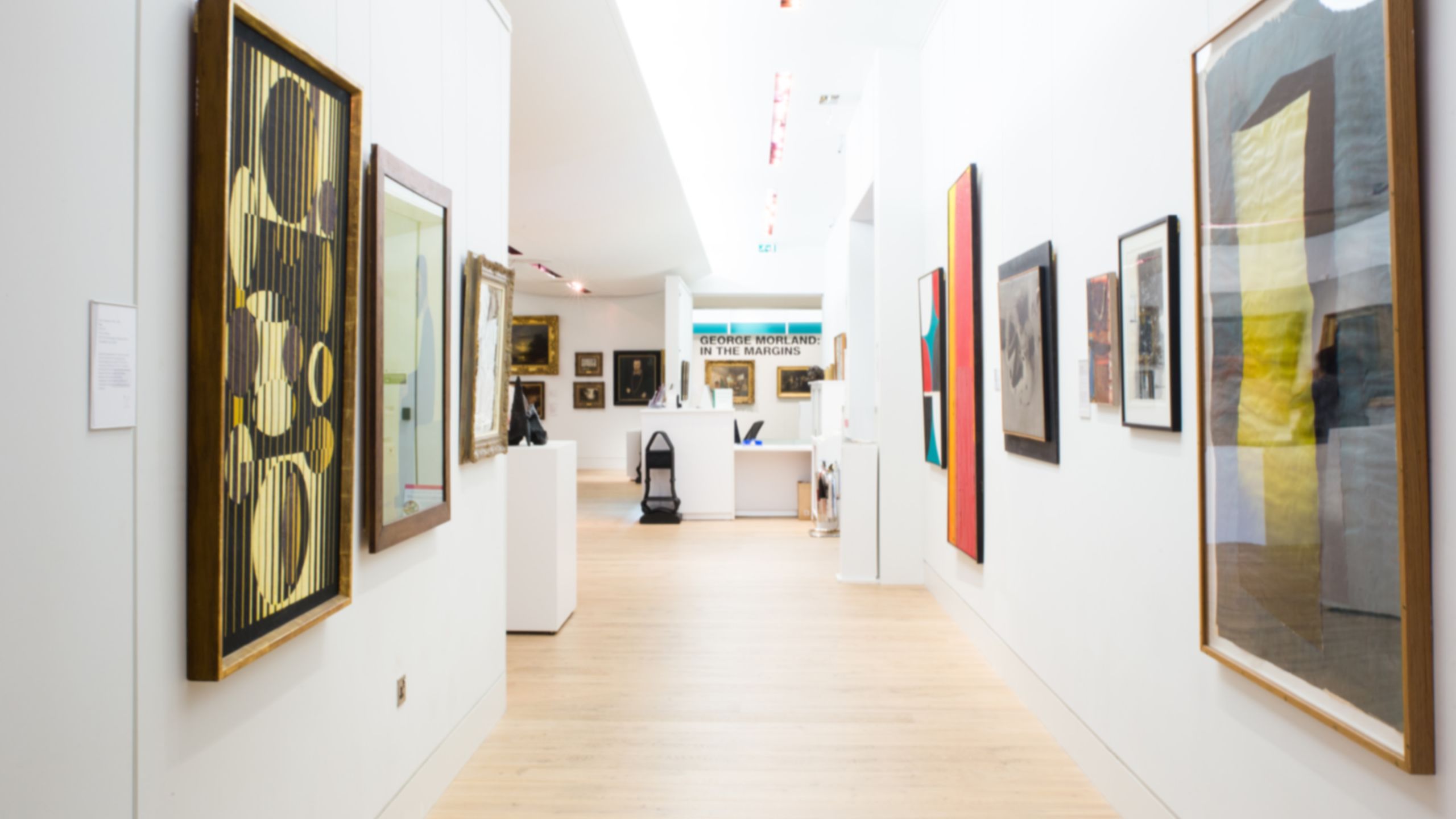
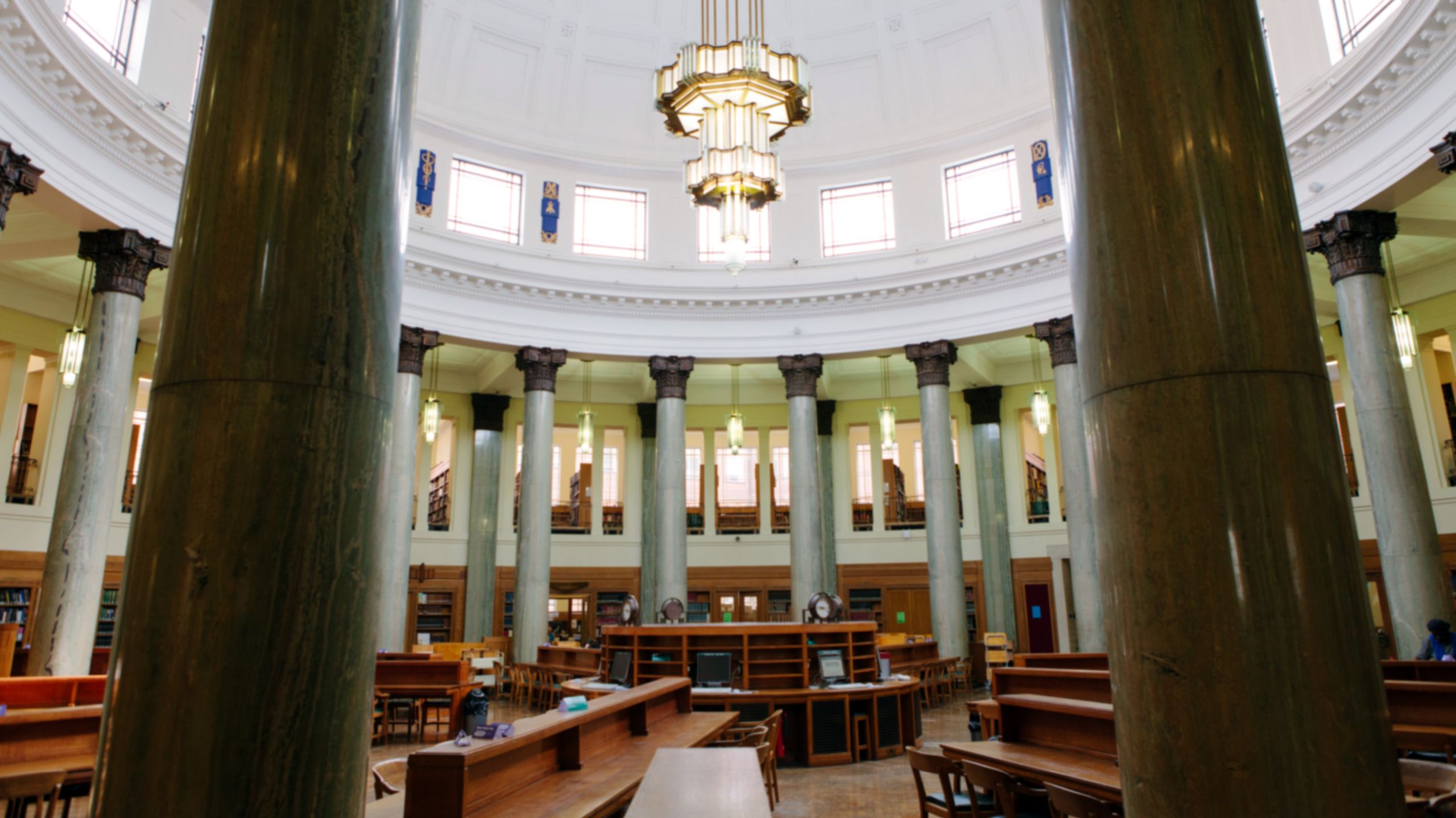
The Stanley and Audrey Burton Gallery.
The Stanley and Audrey Burton Gallery.
‘Grid’
Limited use
You can use a ‘Grid’ section in the following situations:
- If you are only adding images to the grid (and removing the default headings and paragraph text). The accessibility practices mentioned in the ‘Images in the Media section’ part of this page will also apply here.
- If you are adding images, a short heading (a phrase or two) and a short sentence (up to 20 words) of paragraph text in each ‘cell’. Long lines of text could make the column styling disorientating for dyslexic users.

Heading 3
Writing is a medium of communication that represents language through the inscription of signs and symbols.
Heading 3
Writing is a medium of communication that represents language through the inscription of signs and symbols.
Heading 3
Writing is a medium of communication that represents language through the inscription of signs and symbols.
‘Collections’
Limited use
The ‘Collections’ section type can be used in two of the three ‘Layout’ styles in ‘Section Options’.
The ‘Default’ and ‘List’ styles are accessible. The ‘Grid’ style is not accessible when used with background images as the contrast between the text and the images behind cannot be controlled to always be strong enough.
Also note that Shorthand doesn’t allow you to apply alt text to the images so they mustn’t contain important information, they must be decorative.
 Built with Shorthand